|
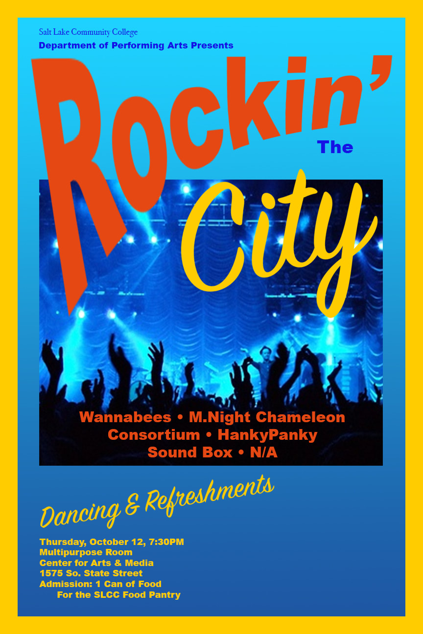
Background & Border: The poster was set up as an 11X17 inch poster with a half-an-inch border. To add a little interest to the background I added a vertical gradient. The branding colors for Salt Lake Community College are light blue and yellow so I chose to use these colors as the background and border. This poster is for an upcoming concert.
Picture: I found the picture at www.google.com/search?q=Images:+Rock+Concert&rlz=1C5CHFA_enUS620 . It was licensed on Google Images as “Licensed for Reuse.” This is a simple screenshot. I thought the colors were suitable for the background and with all of the needed work on text I really did not feel the need to photoshop the picture. Text: The standard font for the poster is Arial Black in different sizes and colors. I decided to stay with one style of font to lend consistency and repetition to the project. The word “Rockin’” was created in red and was warped as a smart object to make it really stand out. As you can see, the word “City” was created in the yellow of the border with the Signpainter font. “City” was also made a smart object to make some slight adjustments. The band names were done in the same red as “Rockin’” to add repetition with Rockin’, yet contrast with the yellow and blue. Upon closer inspection, one can see that I attempted a general upside-down triangle as a formal structure for the text. Actually, it looks kind of like a keystone or cup. “Dancing and Refreshments” uses the Signpainter font in the border yellow color. It too was made into a smart object so as to rotate the text a bit. All text, with the exception of red items is aligned to the left Photoshop Skills •Text Coloring •Text Contrast •Importing a Picture. •Repetition •Alignment •Text Warping •Smart Objects •Working with Layers •Putting in a Border |
|
