I sought inspiration for USU-STARS program from other sites. I have been impressed with an ad campaign at Salt Lake Community College. There has been a series of these graphics. I thought I would import the basic premise for this USU Campaign. |
|
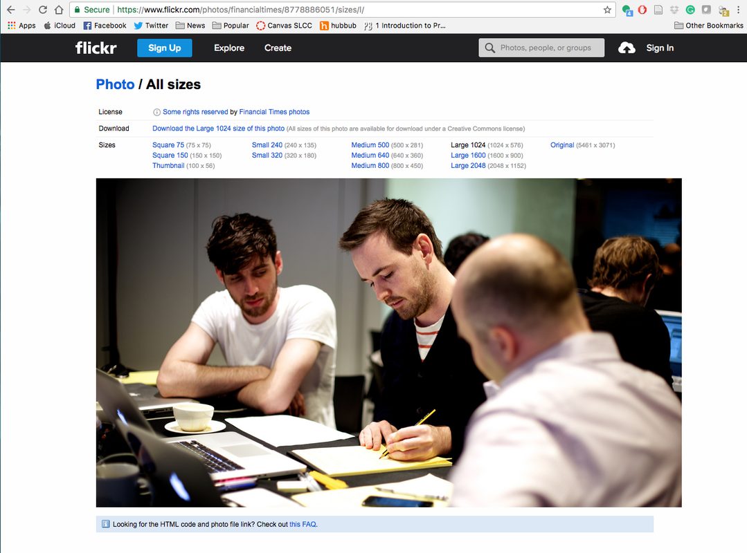
The idea is to portray work in a different setting. I located a picture in the open resource pictures sites at: www.flickr.com/photos/financialtimes/8778886051/sizes/I/
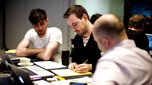
I imported the 2048-pixel picture into Photoshop:
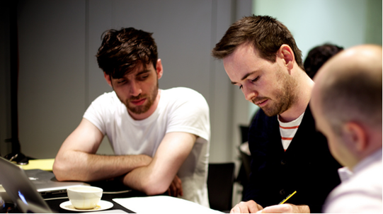
In Photoshop, a new project was created with white background of 1920X1080 pixels with 72 resolution and working with RGB color. In placing the picture, I move the main character over to the left so that his head and face are at the crossing point of 3X3 grid, this leaving room in the lower 2/3 for the text.
In placing the picture, I move the main character over to the left so that his head and face are at the crossing point of 3X3 grid, this leaving room in the lower 2/3 for the text.
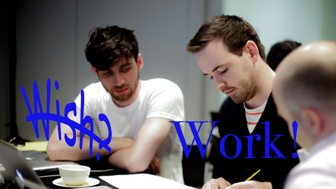
I then applied the text “Wish?” and “Work!” I wanted the word “Work!” to stand strong with power and for the word “Wish?” to be rather lame. Thus using the text warping tools I gave the word “Wish?” a frown, a droop, and a strikethrough to indicate the lameness of wishing as opposed to working. Comic Sans MS was chosen as font that conveyed triviality to wishing. The font for "Work!" is Bodini 72 Oldstyle. I felt it conveyed the power of working for the poster.
The original picture provided some initial inspiration as the student to the left is looking rather wishful will the student on the right is getting down to business and working. The dark shadows on the left student also convey the message as opposed to the lighter lighting for the student on the right. Below is the final poster.
The original picture provided some initial inspiration as the student to the left is looking rather wishful will the student on the right is getting down to business and working. The dark shadows on the left student also convey the message as opposed to the lighter lighting for the student on the right. Below is the final poster.

